
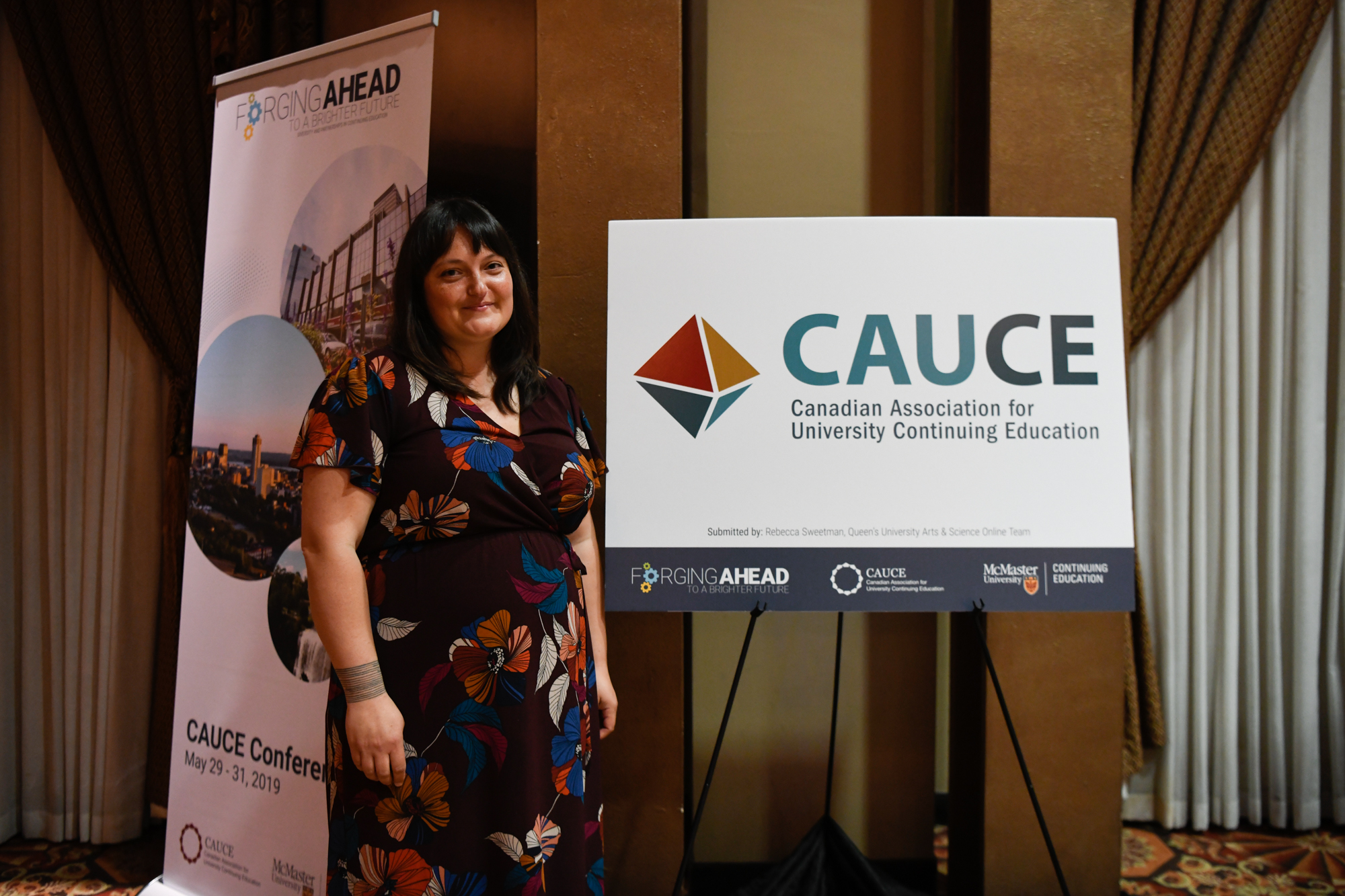
The design was created by Rebecca Sweetman as part of the Queen’s University Arts & Science Online team: Beverly King, Julian Enright, Lindsey Fair, Nadia Morel, Corey Russell, and Rebecca Sweetman.
The octahedron is comprised of eight connected equilateral triangles, representing balance, equity, and an integrated but multi-faceted approach. In sacred geometry, the octahedron represents the integration of higher knowledge through an open and equitable exchange. One of the five Platonic solids, Athenian philosopher Plato associated the octahedron with the element of air, which in various traditions represents creativity, uniqueness, the mind, wisdom, movement, winds of change, and vital breath. The element of air is also seen as an intermediary or bridge between the elements of fire (creation, transformation) and water (purification, emotions, intuition).
The